Contact Us Widget
Configure the appearance and behavior of the Contact Us widget on your storefront. The widget provides customers with a simple and accessible way to contact your support team directly from any page.
Floating Contact Button
The floating contact button appears on the side of your storefront and allows customers to quickly open the contact form.
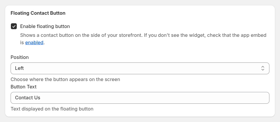
Enable floating button – displays the contact button on your storefront. If the widget does not appear, make sure the app embed is enabled in your store.
Position – choose where the button appears on the screen (for example, left or right side).
Button Text – defines the text displayed on the floating button (for example, Contact Us).
Page Widget
In addition to the floating button, you can embed the contact form directly on any page of your store.
To add the contact form to a page:
- Open the Shopify Theme Editor.
- Navigate to the page where you want the form to appear.
- Add the Contact Form block to a section.
This option is useful if you want to create a dedicated Contact page for customer inquiries.
Form Settings
These settings apply to both the floating widget and the embedded page widget.
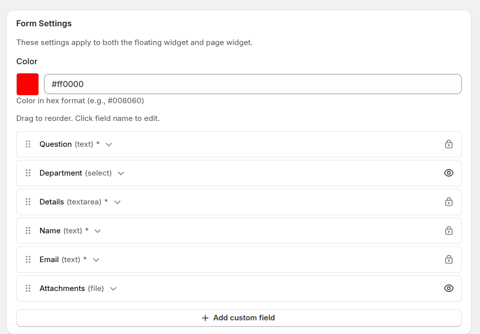
Color – sets the main widget color using a hex value. This helps match the widget with your store’s branding.
Form fields – define which fields appear in the contact form. You can customize the form to collect the information your support team needs to process requests efficiently.
Available default fields include:
- Question – a short subject or title of the request.
- Department – allows customers to select the appropriate support department.
- Details – the main message area where customers describe their issue.
- Name – customer’s name.
- Email – contact email used for replies and notifications.
- Attachments – allows customers to upload files such as screenshots or documents.
Custom Fields
You can also add your own fields to collect additional information from customers.
When creating a custom field, you can configure:
- Field label – the name of the field displayed to customers in the contact form.
- Field type – defines how customers will provide information.
Supported field types:
- text – a single-line input field.
- textarea – a multi-line field for longer messages.
- select – a dropdown list with predefined options.
- file – allows customers to upload files.
- checkbox – lets customers confirm or select an option.
You can drag and reorder fields to control how the form appears to customers, and click a field name to edit its settings.